Thinking about a kitchen update? Learn how color choices shape design, function, and mood in Boston homes, plus ideas for timeless remodeling.
Bold and Beautiful: Using Color Trends in Boston Kitchen Remodeling
Is your kitchen starting to feel outdated, but you’re unsure how to make a change without a full overhaul? One of the simplest and most effective ways to refresh a space is with color. The right palette can add warmth, create drama, or bring out the character of your home.
Here in Boston, homeowners often want a kitchen that feels current while still honoring the timeless charm of New England architecture. That balance can be tricky to achieve, which is why thoughtful color choices are so important. In this blog, we’ll explore the latest kitchen color trends, practical ways to use them, and inspiration drawn from local homes.
Why Color Matters in Kitchen Remodeling
Color sets the mood in any room, but in the kitchen it carries even more weight. This is the space where families gather, friends are entertained, and everyday life unfolds. The shades you choose can make a kitchen feel bright and lively, cozy and inviting, or sleek and modern.
In Boston, where many homes blend historic details with modern updates, color also becomes a bridge between past and present. We’ve seen clients completely transform older kitchens by moving away from tired finishes and embracing a fresh palette. Beyond style, thoughtful color choices can enhance resale value, as buyers are drawn to kitchens that feel updated and well-designed.
How Color Choices Affect Functionality
While color is often seen as a design detail, it also plays a big role in how practical a kitchen feels day to day.
- Lighting and brightness: Darker tones can create a moody, dramatic effect, but they absorb light. In Boston’s older homes with smaller windows, pairing darker cabinetry with lighter walls or counters helps keep the room from feeling closed in.
- Space perception: Lighter colors make a compact kitchen feel larger, while deeper tones can ground a spacious, open layout. This is especially useful in suburban homes with generous square footage versus city condos where every inch counts.
- Maintenance and wear: Some shades show dirt and wear more quickly. For example, pure white cabinetry looks clean but may highlight every smudge, while soft greige or light oak disguises everyday marks more easily.
By thinking about both beauty and function, homeowners can select a palette that not only looks great but also works well with their lifestyle.
Top Kitchen Color Trends in Boston
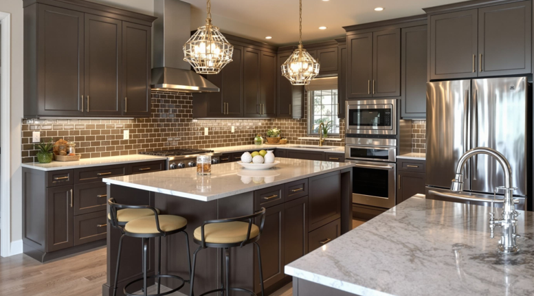
Moody blues and greens
Deep navy, forest green, and sage are becoming favorites for cabinetry. These hues add sophistication and pair beautifully with brushed brass or matte black hardware. In Brookline colonials, for example, navy lowers and white uppers can feel both traditional and fresh.
Warm neutrals with texture
Instead of stark whites, many homeowners are leaning into taupe, greige, and beige. These tones bring warmth and feel especially welcoming during long New England winters. Natural wood accents, like oak shelving or walnut counters, layer in even more texture and depth.
Two-tone cabinetry
Combining darker base cabinets with lighter uppers creates dimension and interest. It’s a versatile look that works well in both traditional and modern kitchens. In downtown condos with open layouts, this approach can help define the kitchen as its own space.
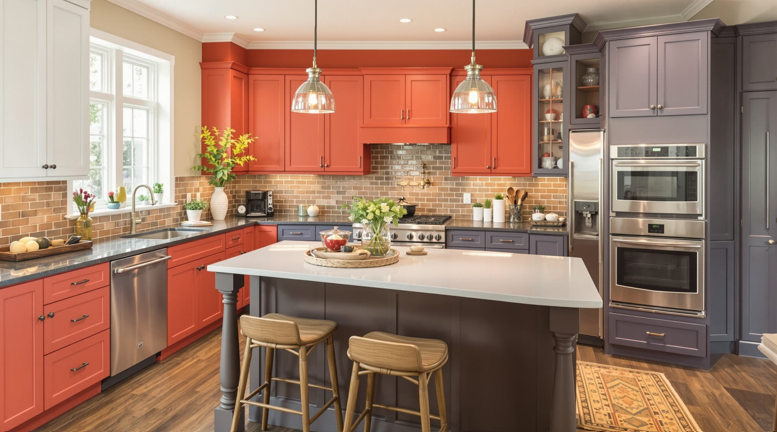
Striking accents of color
From statement islands painted in teal or burgundy to patterned backsplashes, accent colors are a great way to inject personality without overwhelming the entire space. Many Boston homeowners choose to experiment here, since accents can be updated more easily than full cabinetry.
Earth-inspired palettes
Another growing trend is the use of natural, earthy colors—think clay reds, terracotta, and soft stone tones. These shades bring warmth and complement the historic character found in many Boston-area homes.
How to Incorporate Color Without Overwhelming Your Space
Adding color doesn’t have to mean committing your entire kitchen to one bold choice. Small, thoughtful updates can bring just as much impact.
Smart ways to use color
- Paint an accent wall for a quick refresh
- Use colorful backsplashes or patterned tile for visual interest
- Choose cabinetry in a muted hue that feels timeless yet stylish
- Add a standout island to anchor the room
- Incorporate color through appliances, bar stools, or light fixtures
- Experiment with flooring materials, such as patterned tile or stained hardwood
If you’re unsure how to balance color with your home’s architecture, our kitchen design team can help you create a plan that feels cohesive and uniquely yours.
Balancing Trends with Timeless Style
Design trends come and go, but a kitchen should look beautiful and function well for many years. The key is blending classic elements with on-trend details. Neutral countertops, natural stone, and clean-lined cabinetry provide a foundation that will stand the test of time. Accent walls, lighting fixtures, and decorative hardware can then be updated more easily when your style evolves.
As part of our kitchen remodeling services, we guide homeowners in choosing which details to invest in for long-term value and which can be flexible for future updates. This approach ensures your kitchen feels fresh today without limiting your options tomorrow.
Local Inspiration from Boston Homes
Working in the Boston area means every project is unique. Historic brownstones, classic colonials, and sleek downtown lofts all offer different opportunities for creative use of color.
Brownstones: Rich jewel tones like emerald green or sapphire blue often enhance the historic character, while warm brass hardware ties everything together.
Colonials: Soft neutrals or two-tone cabinetry can brighten traditional layouts and add a modern twist without losing charm.
Lofts and condos: Bold islands, dramatic lighting, and contrasting finishes work beautifully in open-plan spaces, creating a kitchen that feels distinct yet connected to the larger room.
In our showroom, you can see how these palettes look in real life, making it easier to imagine how trends will translate into your own space. It’s a place where ideas take shape and design decisions feel more confident.
Conclusion
Color is one of the most powerful tools for transforming a kitchen. Whether you prefer vibrant tones or understated neutrals, the right choices can make your space more inviting, functional, and uniquely yours.
We’ve helped countless Boston-area homeowners reimagine their kitchens with carefully chosen palettes, and we’d love to help you do the same. With expert guidance, quality craftsmanship, and a showroom full of inspiration, we make it easier to bring your vision to life.